the fibonacci
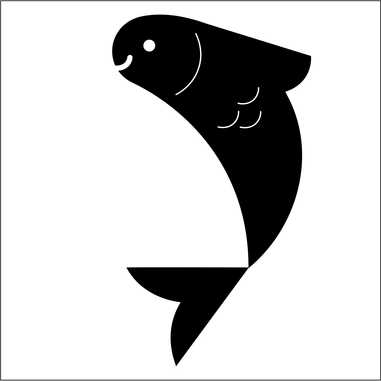
fish
This logo-creation process combines shape-to-figure practices with fibonacci systems for even layouts and serves as a fun exercise to practice aesthetics and typography.
WHAT IS IT?
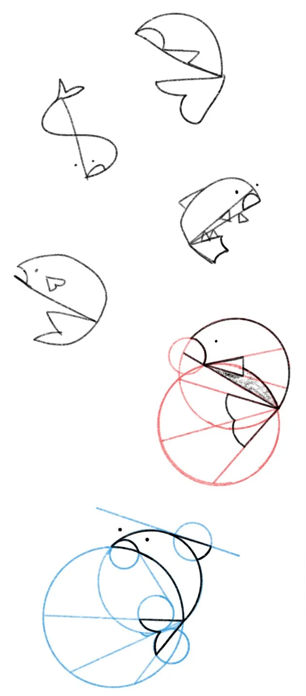
The initial logo design of the project consists of drawing animals (in this case, a fish) using only lines and shapes. Utilizing the connecting points where these shapes come together, you can see where the form of the logo begins to take place, and even add in some small details (like the gills.)
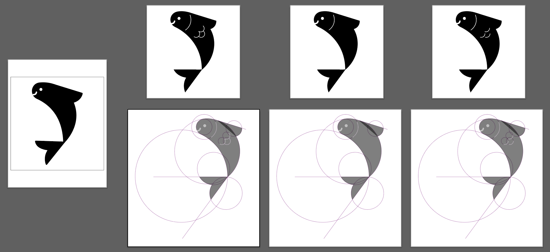
Later on in the project we took it to the next step by combining the logos with a ‘slogan,’ or something that went along with the animal to create a full design. The layout of the full design takes place on a fibonacci grid. Hence, The Fibonacci Fish!
How did you design it?

I learned some new techniques for logo design that are different from just tracing over an image or trying to keep things looking too realistic; with this project I was really able to have fun with the design of my little fish character and make him look as silly as I wanted, while using the supporting type studies to give it a nice branded look in the end.
what did you learn?
Together, the full composition makes a fun blend of a fully shape-created logo, and a slogan with a touch of color to add to the design of the full image. I loved getting to work on these shape-based logo projects and felt it was a great way to understand the shape that underlies not only logos, but their backgrounds too.
the result…
